LMNO
Redefining an agency’s visual identity for better visibility across Canada.
LMNO, is an awesome creative and consulting agency that is all about brand experience and consumer engagement. They hit us up at a pivotal milestone in their development.
Our mission was to inject some fresh ideas to boost their visibility on the national scene. Starting from their original red dot concept, we empowered the design language to not just grow but shine amongst the competition.
Our mission was to inject some fresh ideas to boost their visibility on the national scene. Starting from their original red dot concept, we empowered the design language to not just grow but shine amongst the competition.
Services:
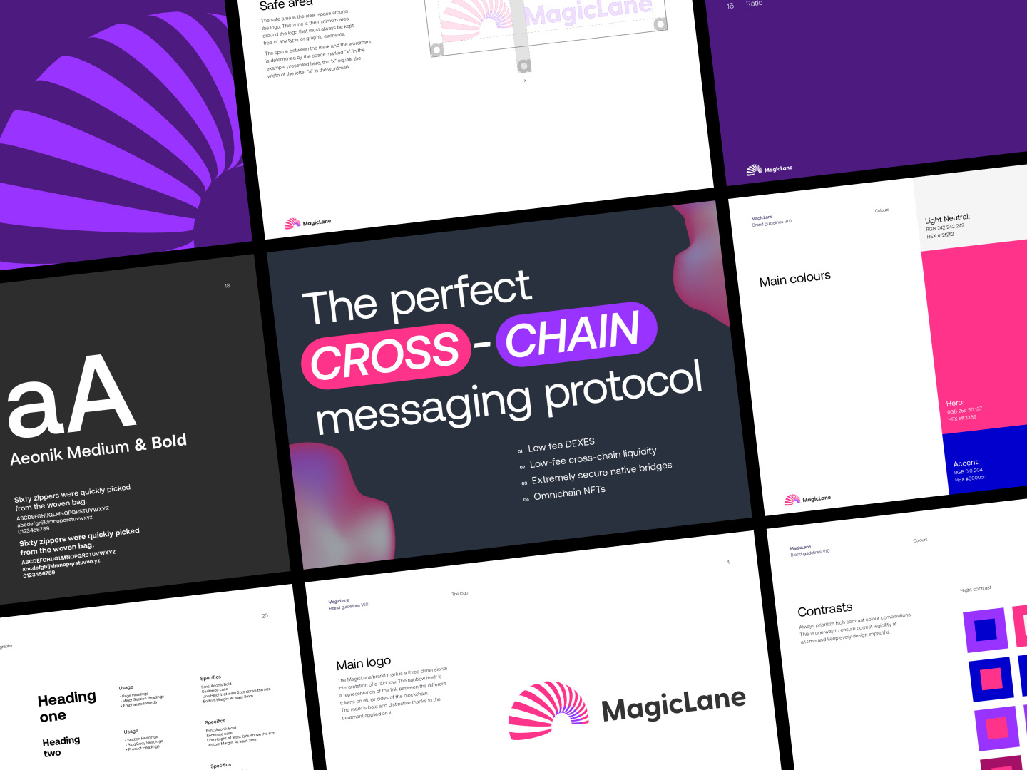
Brand development
Editorial design
Creative workshop
Editorial design
Creative workshop
When we kicked off this project with LMNO, their visuals were a bit stuck in a narrow lane – limited colors and design elements. But in the age of sleek websites and content generation, our mission right away was to shake things up!
Working within their current spectrum, we spiced up the design game and gave LMNO a modern facelift. Think of it as our way of making them stand out in the digital crowd and catch the eyes of their peeps. Let's just say, we wanted to make LMNO the cool kid on the digital block with a whole new look and feel.
Working within their current spectrum, we spiced up the design game and gave LMNO a modern facelift. Think of it as our way of making them stand out in the digital crowd and catch the eyes of their peeps. Let's just say, we wanted to make LMNO the cool kid on the digital block with a whole new look and feel.


The entire LMNO team embraced the new look
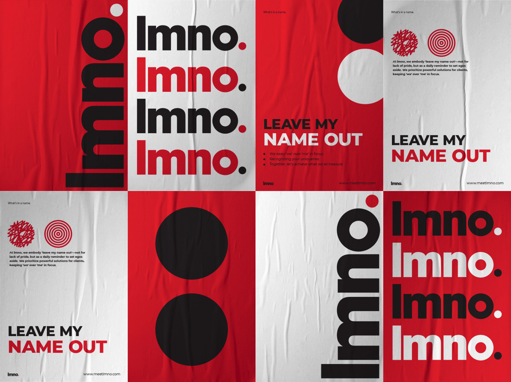
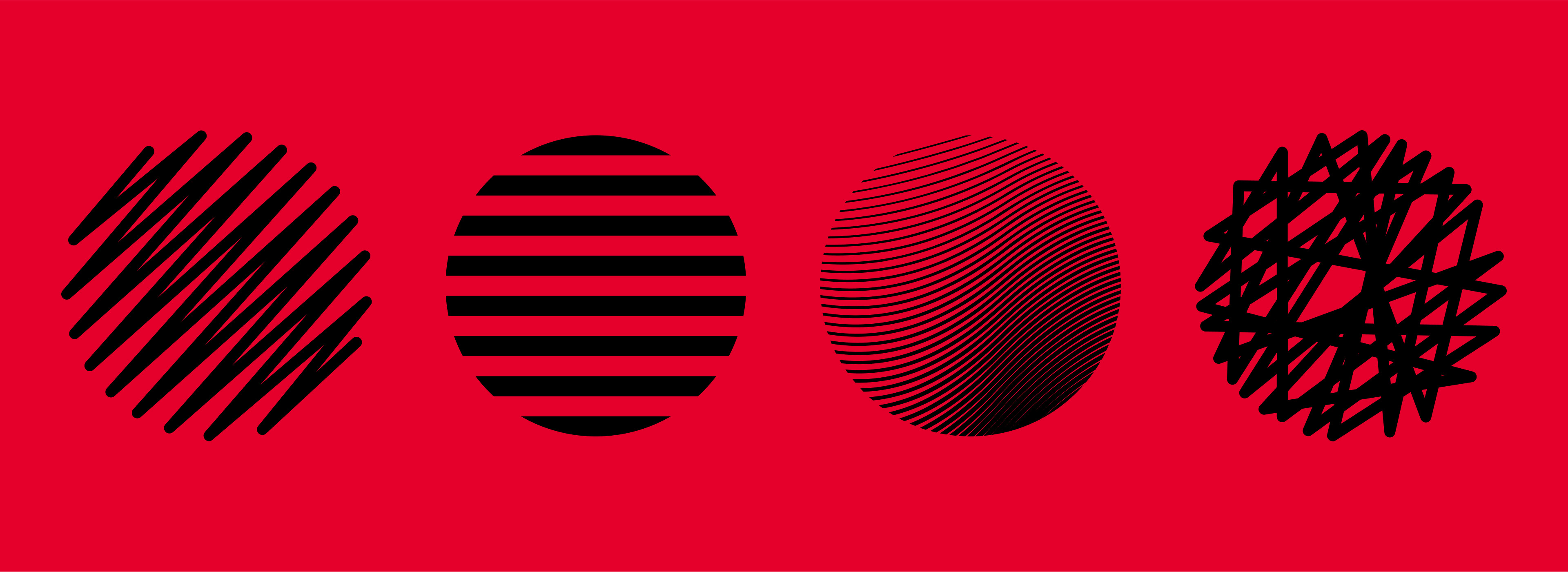
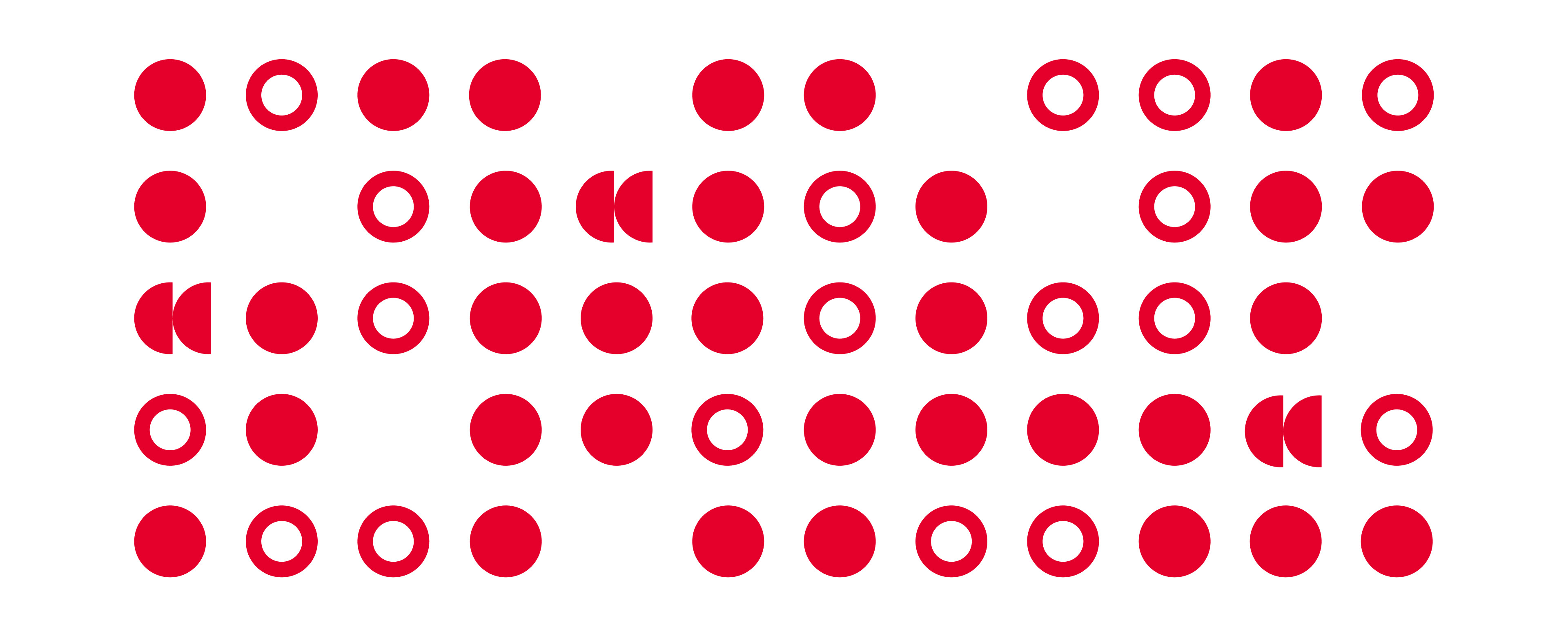
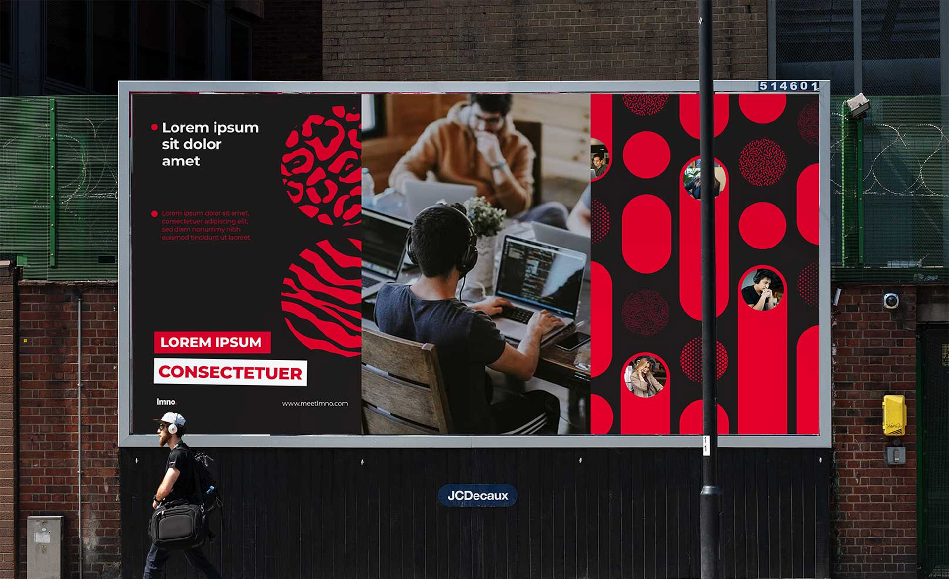
Starting with LMNO’s dot concept, we took it through a systematic metamorphosis and twisted it into a thousand variable shapes, sprinkled with hand-drawn patterns and geometric vibes. We also took the original three colors on a wild ride: inspired by Swiss design principles, we cooked up compositions that are as dynamic as they are eye-catching. The result? A visual identity transformed from a conservative aspect, to a whole new level of eye-catching. It’s all about aligning LMNO with a cutting-edge aesthetic in their competitive landscape.
In a remarkably brief span, we executed a profound metamorphosis of LMNO's visual identity. harmonized with their core values. It's not just about the dots, twists, and colors; it's about weaving a story about their people and ambitions. We didn't just win over the designs; we won over hearts. The entire LMNO team embraced the new look. With the mission accomplished, we've been entrusted to craft new projects based on the new design system.
Credits
Design: Val Nogues
Creative Direction: Joao Ferraz
Project management: Suzan Van Borkum
©Superside
Creative Direction: Joao Ferraz
Project management: Suzan Van Borkum
©Superside